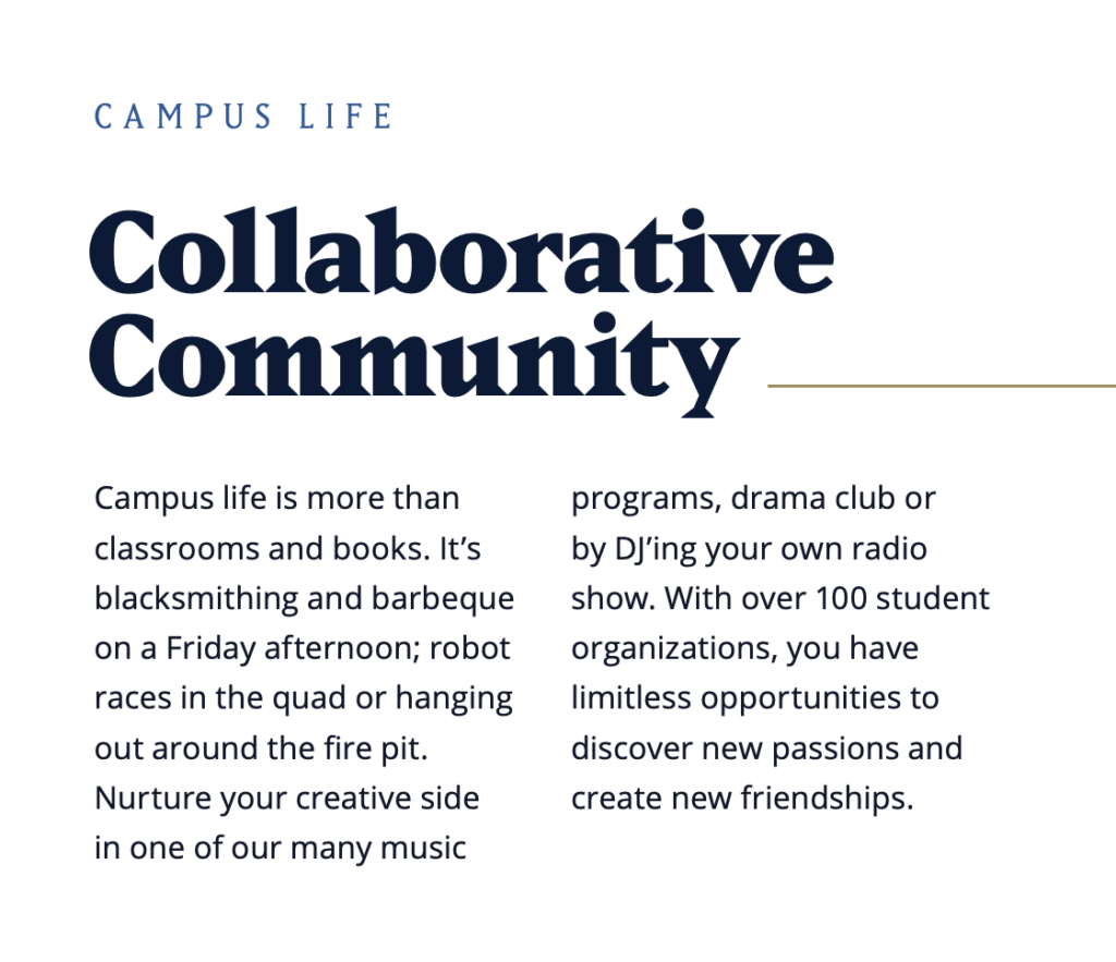
Typefaces and how they are presented are as important to South Dakota Mines’s identity as the use of color, graphics and photography. Clean, well-spaced typography is what distinguishes professional print and digital communications. The typography system of the South Dakota Mines visual brand is made of a display typeface, Matrix II, and a text typeface, Open Sans.
Display Typeface
Matrix II is our primary serif typeface with distinctive geometric characters which is perfect for headlines.
Uses:
- Headlines
- Subheads
- Lead-ins
- Pull-quotes
- Callouts
Special note about opentype features. Using this font we utilize Style Alternatives 2 and Lining Figures.
Style Alternatives 2 turns the g into g.
Lining Figures lines up the numbers on the baseline like:
12345 12345
Foundry: Emigre
Matrix II font is available with a paid Adobe Creative Cloud subscription. If you do not have an Adobe subscription, please use the Digital/Web Safe Alternatives below.
The quick brown fox jumps over the lazy dog.
Regular
Italic
Bold
Bold Italic
Extra-Bold
Text Typeface
Open Sans is our primary sans-serif family and a workhorse for our communications. It performs well at small sizes and in longer-form text.
Uses:
- Body Copy
- Subheads
- Callouts
- Captions
Foundry: Ascender Fonts (released as open source)
Download Open Sans from
Google Fonts
The quick brown fox jumps over the lazy dog.
Light
Light Italic
Regular
Italic
Semi-Bold
Semi-Bold Italic
Bold
Bold Italic
Extra-Bold
Extra-Bold Italic
Digital/Web-safe Alternatives
We understand in different web spaces, our specific typefaces cannot be used. Here are some alternative web fonts for those circumstances.
- Matrix II: Palatino Linotype, Book Antiqua or Palatino.
- Open Sans: Helvetica or Arial.
Use of Type
Using type thoughtfully is crucial to making our designs look professional. Using our two typefaces and their multiple weights, we can create engaging, clean layouts that are easy to read, modern and confident.
Sample Font Pairings and Configurations
Use the examples shown below as a starting point when setting type in a new layout. These proportions are designed for print, but they apply to digital and environmental applications as well. Since our two typefaces pair so well, keep in mind that it is possible to substitute one for the other to create layouts that feel more formal or more casual.


